Blog · Reviews · Oct 6, 2026 · 3 min read
Which image models can spell?
One poster brief with three exact lines of text, six image models, every letter checked. All six spelled it right; they differ on layout and on following the brief.
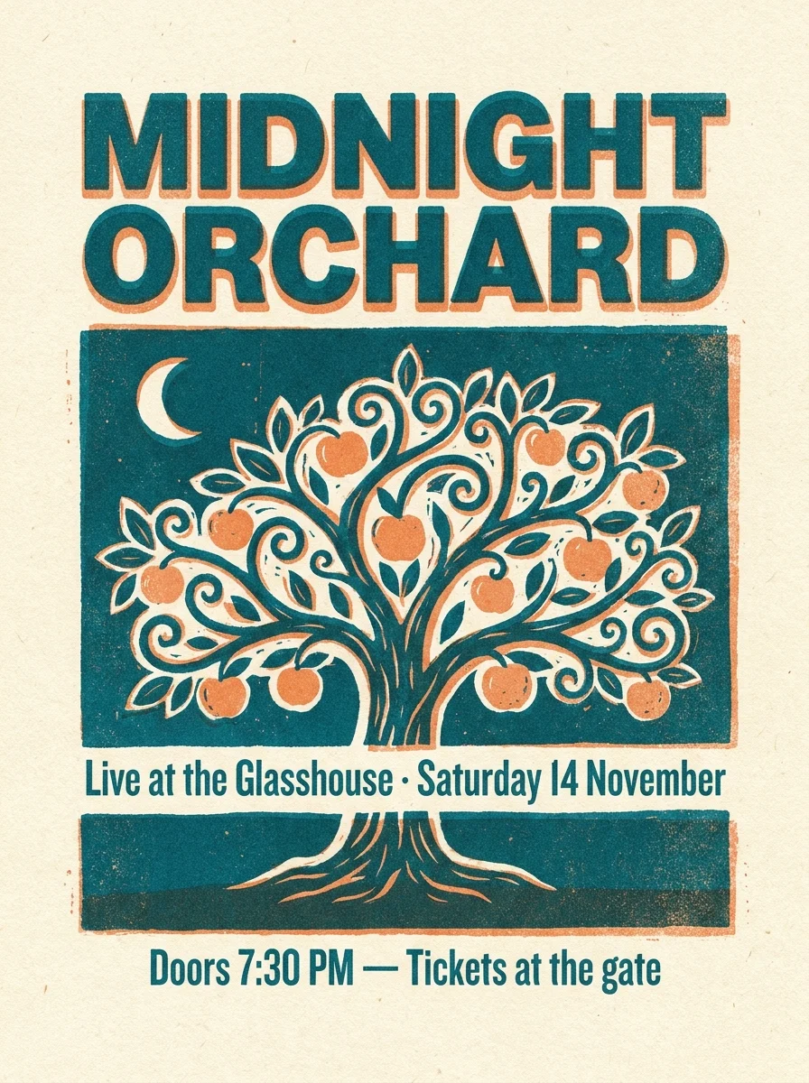
Text inside images used to be the giveaway that a picture was AI-made: a "CONCRET" here, a "Satruday" there. So we set one poster brief on six image models available on Tanvo, ran each once at its default size, and checked every letter.
The brief
Every model got exactly the same prompt:
- A concert poster in a two-colour risograph style, teal and orange on cream paper, with a stylised apple tree at night.
- Exactly three lines of text, spelled exactly as written: the title MIDNIGHT ORCHARD at the top, Live at the Glasshouse · Saturday 14 November in the middle, and Doors 7:30 PM — Tickets at the gate at the bottom.
- No other words, letters or logos.
That is fifteen words, a middle dot, an em dash, a time and a date: enough places for a model to slip. Each model ran once, with no retries and no cherry-picking.
The result: zero typos
All six models spelled all fifteen words correctly. Every word, the date, "7:30 PM", the middle dot and the em dash came out as written, and none of them added stray words or fake logos. A year ago this test would have produced a pile of near-misses; for short, clearly quoted text it is now a solved problem on current models.
What still separates them is how closely they follow the rest of the brief.
Where they differed
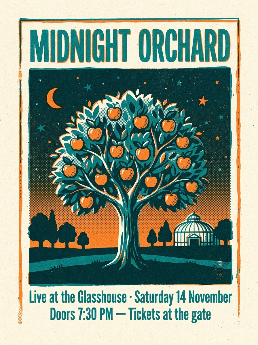
Nano Banana 2 set clean, even type and kept to two colours, but moved the middle line down next to the bottom line instead of leaving it in the middle.
Nano Banana Pro was the only model that put each line where the brief asked: title at the top, venue and date in the middle, doors and tickets at the bottom. It also had the most convincing print texture.
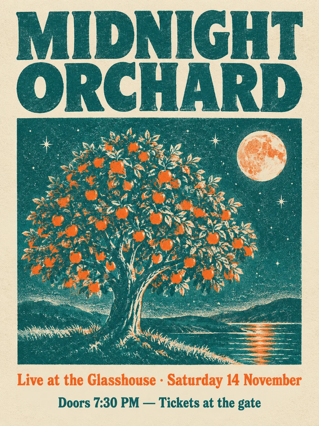
GPT Image 2 chose a heavy vintage display face and a detailed moonlit illustration. The text is perfect; the middle line sits just above the bottom one.
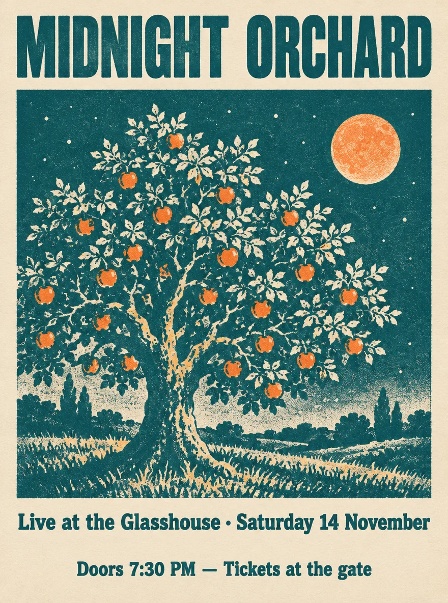
GPT Image 2.5 produced a very similar layout with a wider title and the two lower lines grouped together under the artwork.
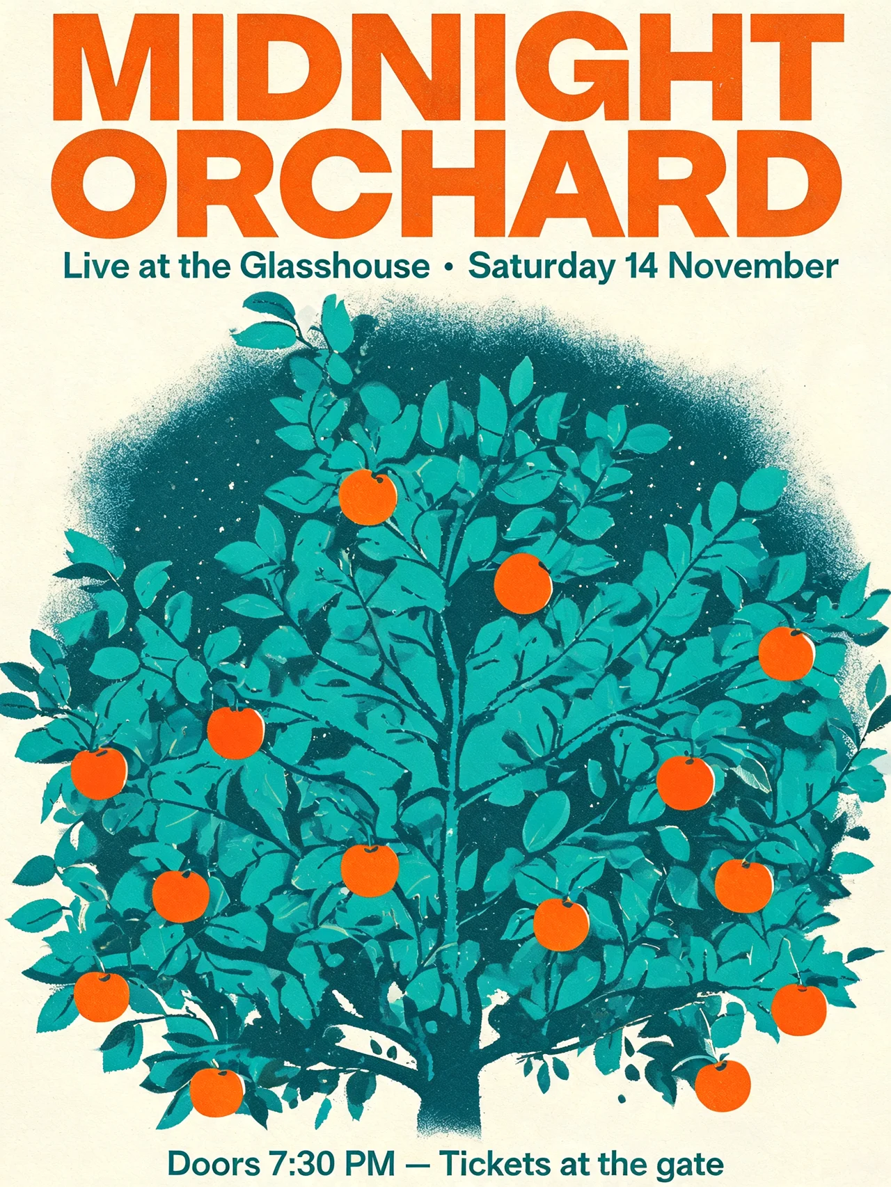
Seedream 5.0 Lite went the other way and placed the venue line directly under the title, leaving the tree to fill the rest of the page. Its type is crisp and modern.
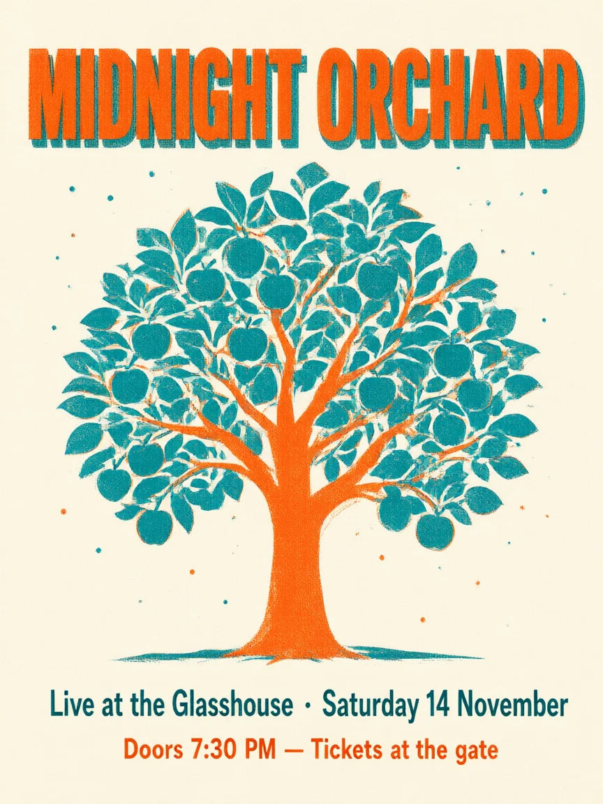
Qwen Image 3 kept the most faithful two-colour risograph look, but dropped the night: the tree stands on a plain cream background with no sky.
What to take from it
- Spelling is no longer the deciding factor for posters, menus, signs and covers with a few short lines. Put the exact text in quotes and say "spelled exactly as written".
- Layout is. If the position of each line matters, say so plainly ("in the middle, between the title and the illustration") and expect to re-run once. Nano Banana Pro followed placement best in this test.
- Style instructions are followed unevenly. Night, two colours and print texture were each dropped by at least one model. Name the one or two style points that matter most and put them first.
- Price differences are small for a single poster. At default settings these models cost between 10 and 50 credits a run on Tanvo, so trying two models side by side is usually cheaper than fixing a layout by hand.
This was one brief and one run per model, so treat it as a snapshot rather than a benchmark. If your design has longer paragraphs of text, a different language or very small type, test it the same way: same prompt, several models, check every letter.
You can run the same brief yourself in the image generator.